
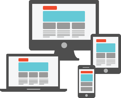
Responsive Design is a method of web design that allows your website to fluidly adapt to any device. A website utilizing proper responsive design concepts will offer the same content, look, and feel regardless of the device it’s being viewed from by carefully planning how to display content. All websites we design are responsive, and will allow your user to enjoy their browsing experience regardless of whether they’re viewing the site from a computer, tablet, or phone.
Our responsive design solutions will make your mobile device visitors happy.
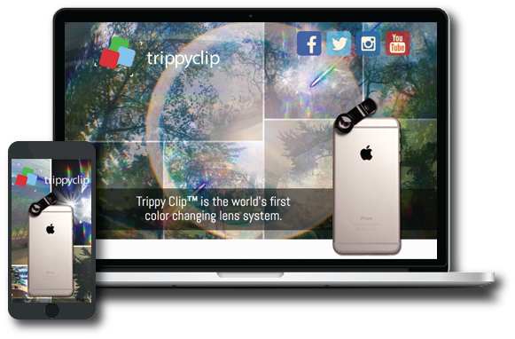
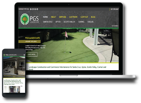
In 2014, 23% of all website traffic was received from Android or iPhone devices, while 13% was driven by tablets.
Having a website that works on mobile devices will allow you to reach an even larger market.
According to smallbiztrends.com, 27% of mobile websites are misconfigured.
As of April 21st, 2015, Google has lowered the search rank of websites not utilizing mobile websites.
